Latest Supercar News
Only the coolest performance and supercar news
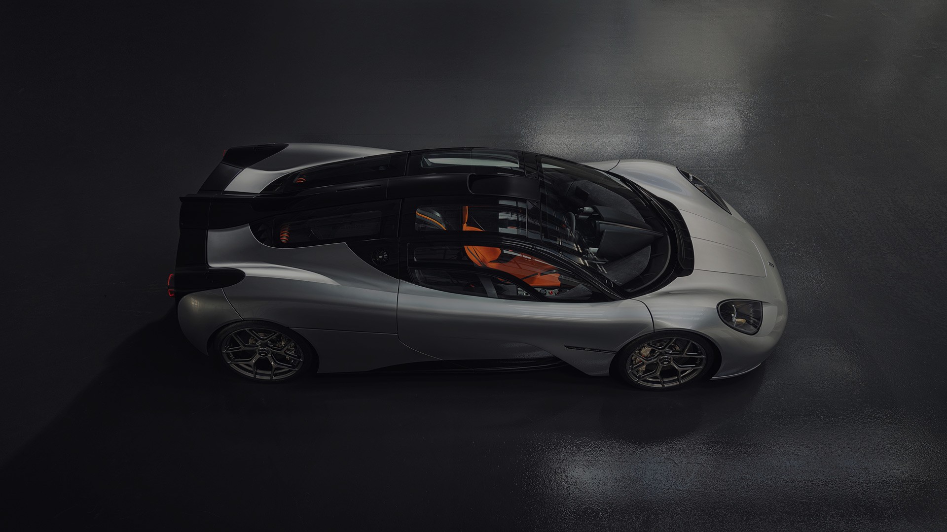
The T.33 is the second developed model from Gordon Murray Automotive and it is still in development. It has been conceived, designed, and engineered without compromise to offer the ultimate blend of performance, comfort, on-road driving experience, and everyday usability. Recent videos released by Gordon Murray Automotive offers a glimpse...
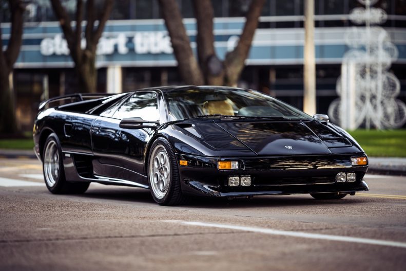
In 1985, Automobili Lamborghini was working on Project 132, with the intention of succeeding the Countach at the top of the Lamborghini range. Starting from scratch, designer Marcello Gandini (who was also responsible for drawing Miura and Countach) sketched a very aggressive, sharp body for what was to become the Diablo....
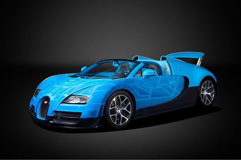
The Bugatti Veyron 16.4 Grand Sport Vitesse, equipped with a formidable 1,200 bhp quad-turbo W-16 engine and open-top design, saw only 92 units produced towards the end of its production. It boasted a top speed of 255 mph (410 km/h), making it the fastest roadster of its time. Bugatti engineers...
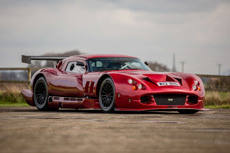
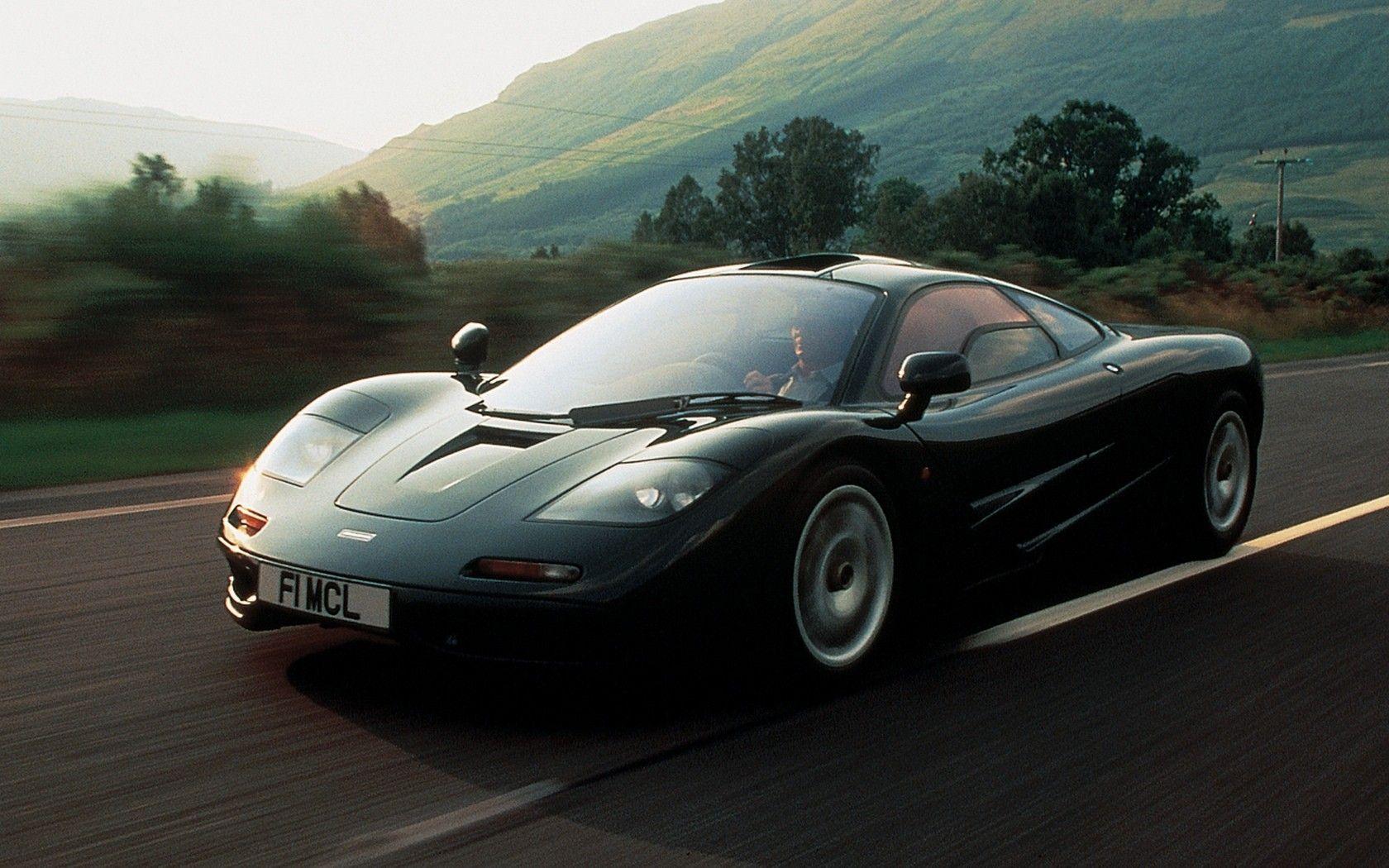
Back in 1998, TVR was dreaming. They wanted to create a faster and more outrageous supercar than the mighty McLaren F1. While they didn’t succeed with the former, TVR definitely created a beast, one that looked like it wanted to eat Mini Coopers for brunch. When it was made, the...
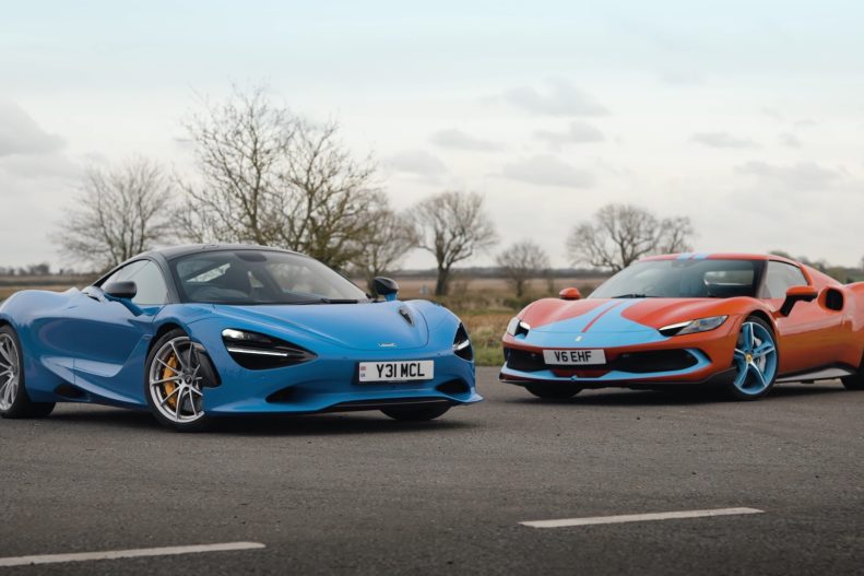
Ferrari and McLaren are known for their engineering prowess and track pedigree, these manufacturers continually push the boundaries of automotive innovation. In a head-to-head showdown brought to us by CAR magazine on YouTube, the Ferrari 296 GTB and the McLaren 750S go toe-to-toe, each aiming for supremacy in the fiercely...
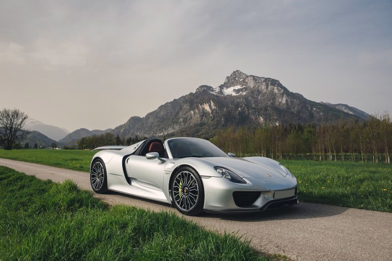
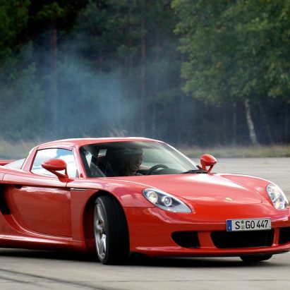
Debuting at the Geneva Auto Salon in March 2010, the 918 marked Porsche’s bold step forward from the legendary Carrera GT. Unlike its predecessor’s traditional supercar approach with a V-10 engine and manual gearbox, the 918’s unveiling signaled a departure, embracing hybrid technology for a glimpse into the automotive future....
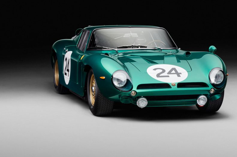
Just 24 months on from the announcement of the prototype example of the Bizzarrini 5300 GT Corsa Revival, the build of the 24th and final car has now been completed in a unique specification. Created in a green-flecked hue known as Bizzarrini Verde Bosco Ventiquattro, (VBV) it’s an appropriate celebration...
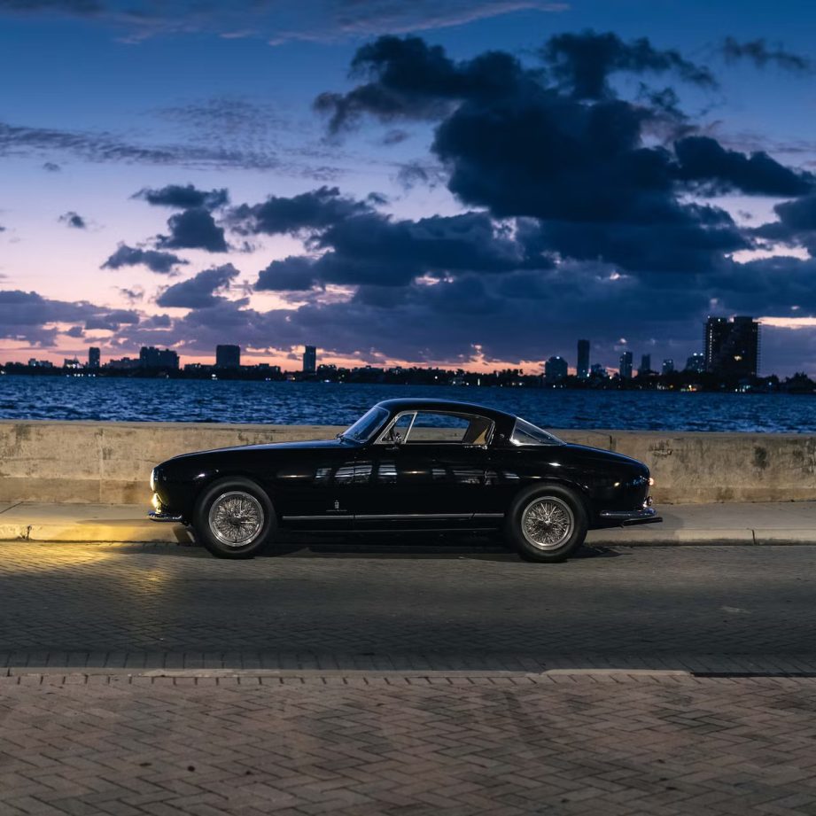
There is a massive following out there in the automotive world when it comes to Ferrari, both new and older, classic models, let’s not forget that some of the world’s most expensive cars are in fact classic Ferraris from a long-gone era, like the 250 GTO for instance, a multi-million...
Introduced in October 2015, the F12tdf, paying homage to the prestigious Tour de France Automobile race, marked a track-focused evolution from Ferrari. Its name recalls the dominance of Ferrari 250 models, clinching victory in the GT class of the race nine times between 1956 and 1964. Lighter by approximately 243...
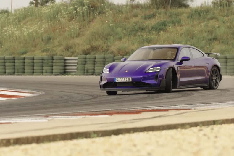
Porsche’s latest creation, the Taycan Turbo GT, stands as a testament to their unwavering commitment to innovation and boundary-pushing design. With a rich heritage deeply rooted in performance, the Taycan Turbo GT is engineered to elevate their electric saloon to unprecedented levels. Boasting upgraded aerodynamics, weight reduction, and formidable power,...
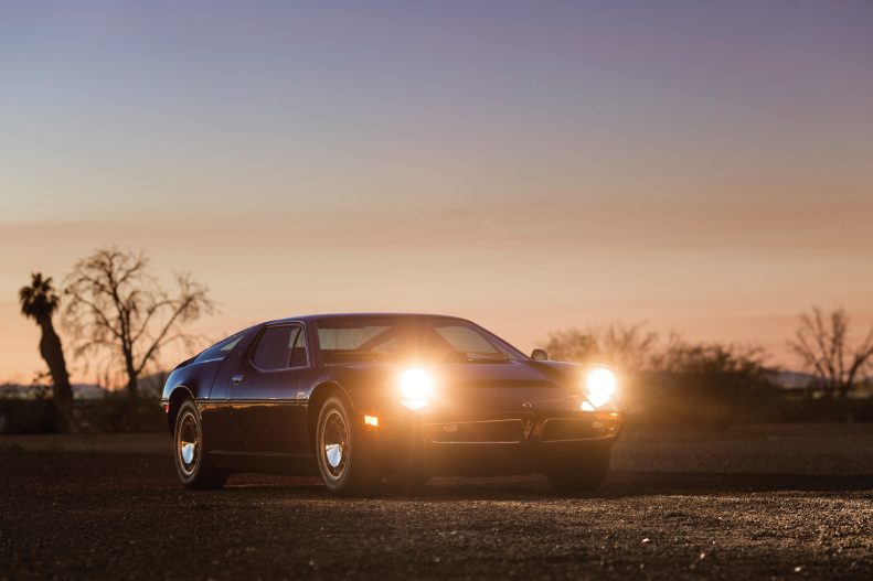
The Maserati Bora was unveiled in 1971 at the Geneva International Motor Show and was produced until 1978 with 564 cars built, not to mention the spectacular Boomerang, a coupé prototype created by Giugiaro with futuristic engineering and wedge-shaped bodywork. Following the trend that had already revolutionized Formula 1 racing...
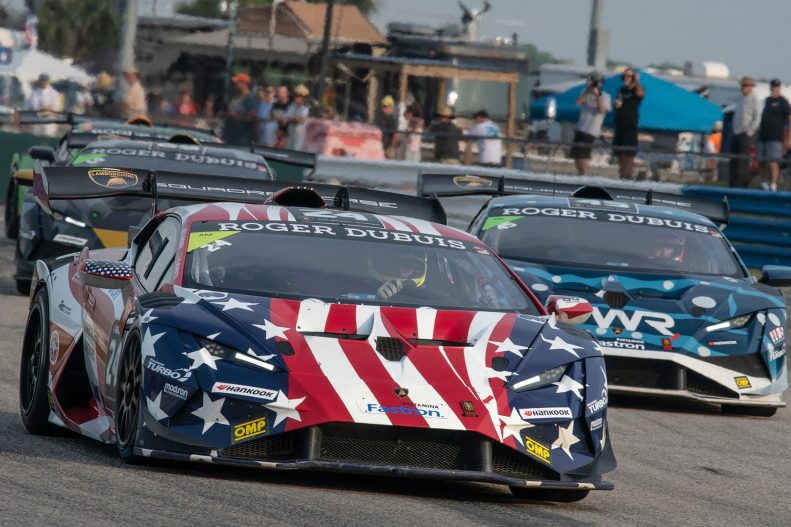
The twelfth edition of the Super Trofeo North America began at Sebring, Florida on the weekend of March 13-16. The second round is set to take place at California’s Laguna Seca circuit from May 10-12. From June 27-29, the Super Trofeo EVO2 will take place at Watkins Glen, New York...
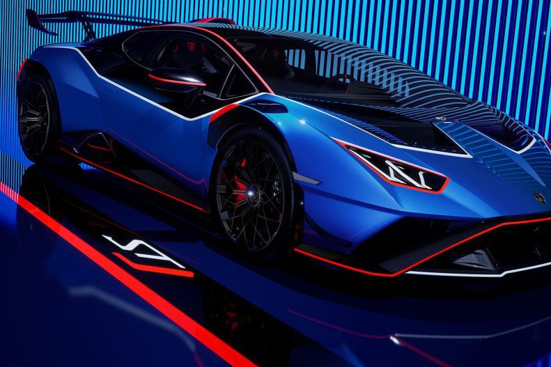
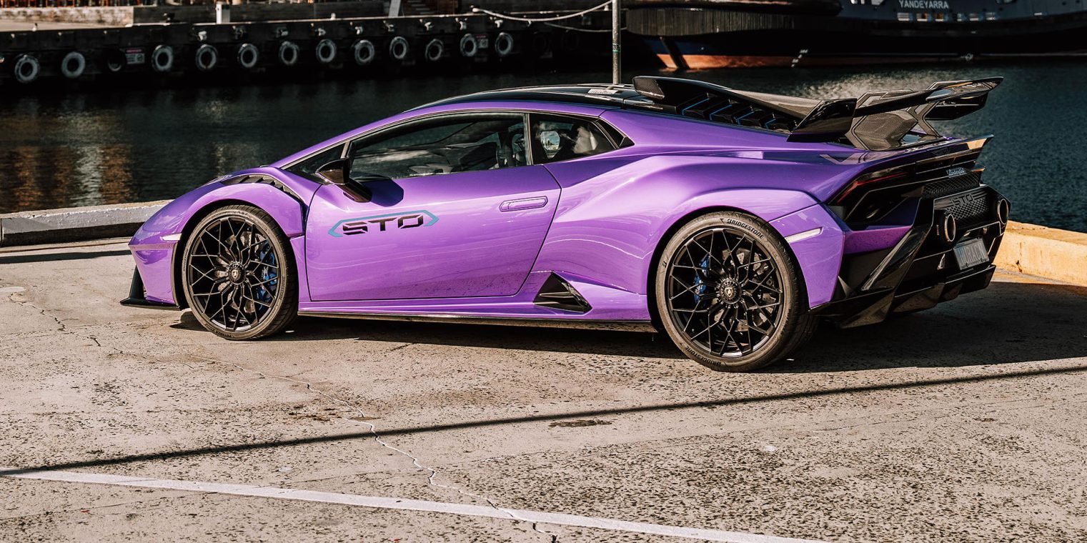
Automobili Lamborghini presents the Huracán STJ, a limited edition of ten units and the last celebration of the super sports car equipped with the V10 engine, an engineering icon of the Sant’Agata Bolognese carmaker. The naturally aspirated V10 engine is a symbol of Automobili Lamborghini’s history, contributing to the success...
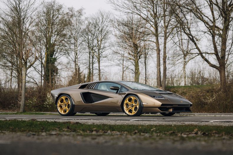
The Lamborghini Countach stands unrivaled among sports cars and supercars as an automotive icon of unparalleled historic significance. Revered as the ultimate poster car among enthusiasts, this 80s Italian marvel blazed a trail for successors like the Diablo, Murcielago, Aventador, and the latest Revuelto HPEV. With early models fetching staggering...
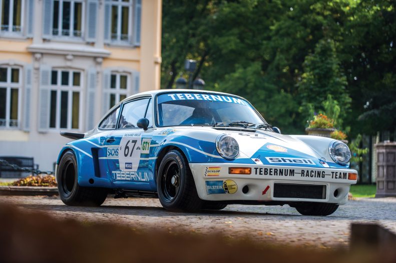
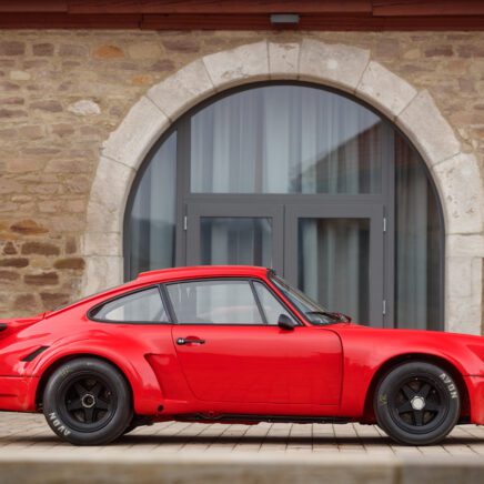
The Carrera RSR 3.0 is one of those rare and super-special Porsches, and one of the most successful Group 4 racing cars ever. Today, the Carrera RSR models rank among the most sought after of all Porsche 911 variants. The Carrera RSR 3.0 was made in small numbers for racing....
More Supercars
There can never be enough car news
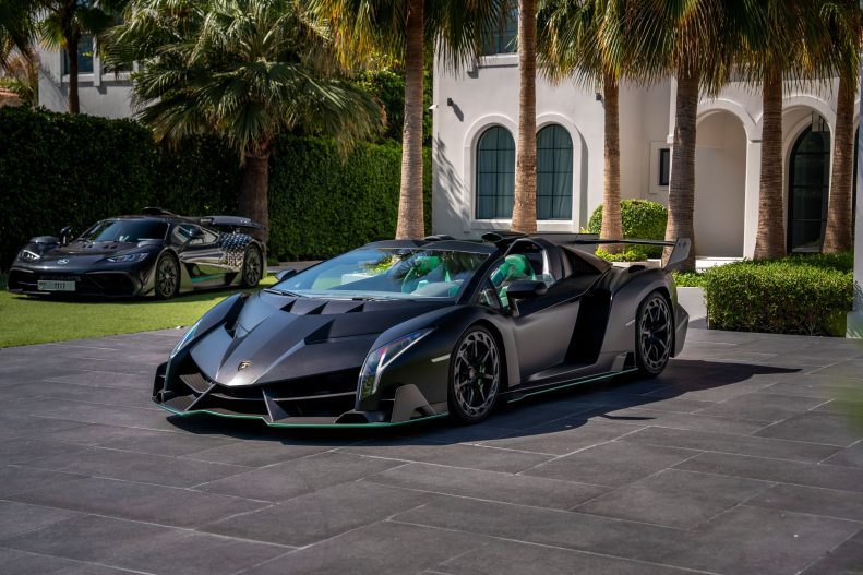
The Lamborghini Veneno is a limited-edition supercar produced by Italian automaker Lamborghini in 2013. It was built to commemorate the 50th anniversary of the Lamborghini company and was based on the Aventador platform. With a maximum output of 750 hp coming from its naturally aspirated 6.5-litre V-12 engine, the Veneno accelerates...

In late January 1965, the production Shelby Mustang GT350, derived from the Mustang Fastback, debuted, promising to captivate enthusiasts. Beyond its striking appearance, the GT350 boasted substantial modifications to its suspension, replacing factory components with racing-grade parts. The Shelby GT350’s most significant improvements took place under the hood, where an...
Few brands evoke the same level of admiration and excitement as Ferrari. For enthusiasts and drivers alike, the opportunity to experience the sheer performance and craftsmanship of a Ferrari is a dream come true. Among the illustrious lineup of prancing horses, one model stands out for its raw power and...
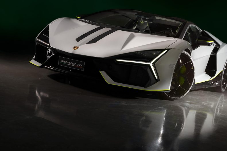
Automobili Lamborghini celebrates the first edition of its Lamborghini Arena event with an exclusive Revuelto created by the company’s Ad Personam customization program, which recently inaugurated its new studio at the Lamborghini headquarters. The special version of the V12 hybrid plug-in super sports car was unveiled during the weekend of...
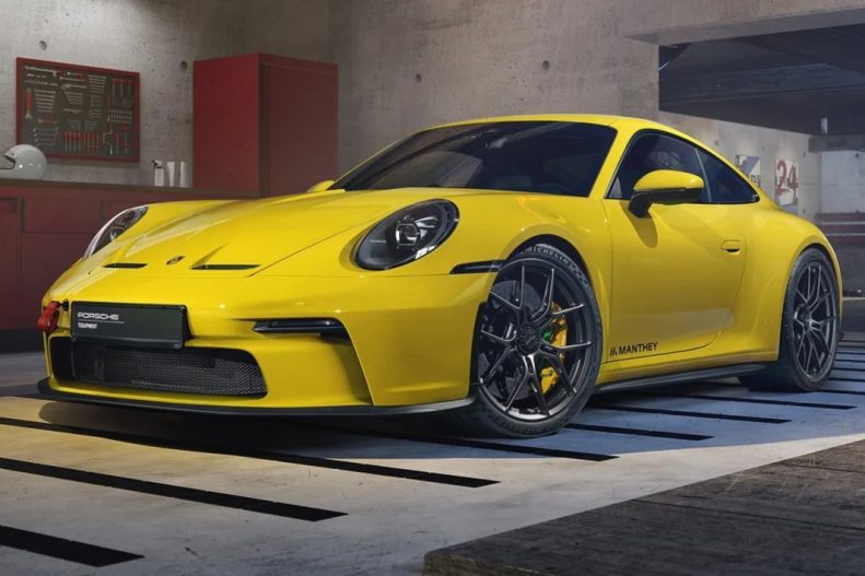
Manthey Racing have just announced a new “MR” Kit, which is now available for discerning drivers who wish to upgrade the performance of their gentleman-spec GT3s. In concert with the GT3 Touring’s original mission and intended appeal, Manthey has refrained from making any radical changes to the car, particularly as...

You’d be forgiven for thinking that the current 992 GT3 RS (or upcoming GT2 RS) are as good as it gets from the German automaker. With cars that are this dominant at the Nürburgring, yet still able to tackle daily chores as reasonably as they do, how do you even...
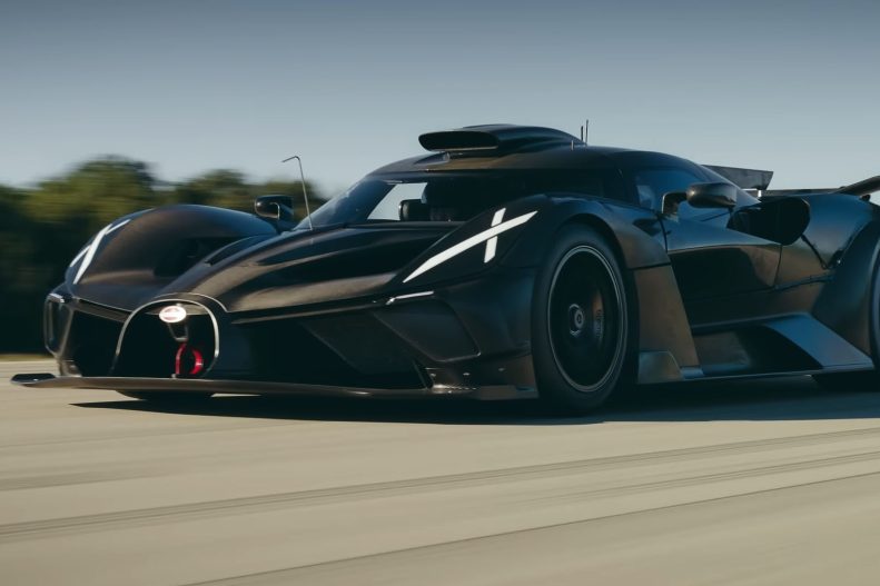
We’ve seen Bugatti’s chief test driver, Andy Wallace, take the Bugatti Bolide on the track for high-speed testing, and up to now, only Bugatti drivers have been in the driver’s seat of this hypercar, but that recently changed as Jack Rix, Editor-in-chief for Top Gear Magazine got some time with...
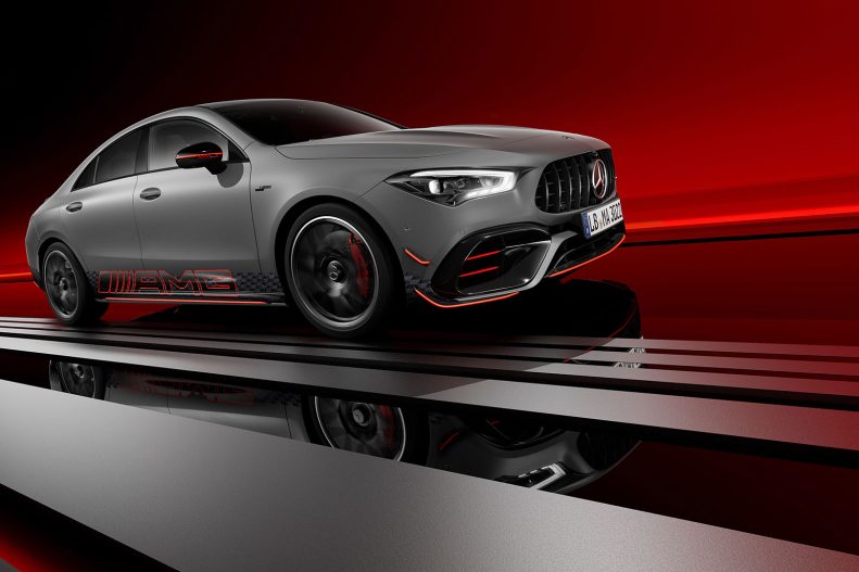
Mercedes-Benz USA elevates the most dynamic model of the AMG CLA portfolio with the new Mercedes-AMG CLA 45 S “Edition 1.” The special edition model features numerous unique exterior and interior design elements, in addition to a generous suite of standard equipment. Limited to only 25 units for the U.S....
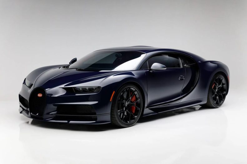
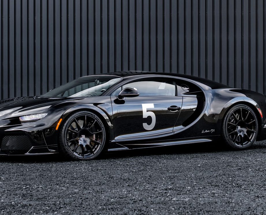
Named in honor of Louis Chiron, the renowned Bugatti racer, the Chiron embodies a legacy shared with its predecessor. It inherits the Veyron’s carbon-fiber framework, Haldex all-wheel drive, and W16 quad-turbo engine, but elevates performance through enhanced stability, road grip, passenger comfort, and power delivery, a testament to Bugatti’s decade-long...
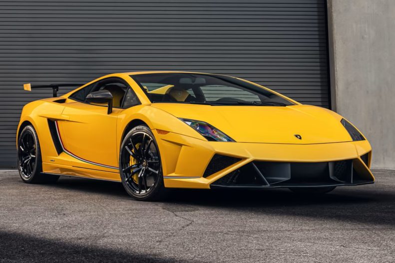
During its 10-year production span, Lamborghini manufactured over 14,000 Gallardos, cementing its status as one of the brand’s most illustrious models. Over time, the model was improved culminating in the unveiling of a second generation in 2008, featuring a groundbreaking 5.2-liter V-10 engine. Following this, numerous limited-edition variants was introduced,...
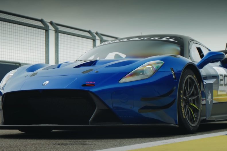
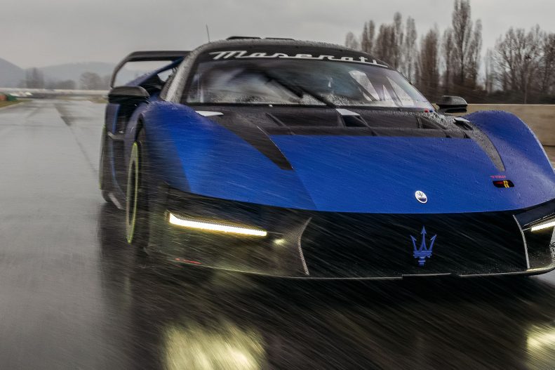
With the introduction of the MC20 GT2, Maserati is embarking on a new journey, melding top-tier performance with accessibility for amateur racers. Derived primarily from the acclaimed MC20 supercar, the GT2 variant boasts Maserati’s signature Nettuno V6 engine, delivering an impressive 621 horsepower and 538 lb-ft of torque. To distinguish...
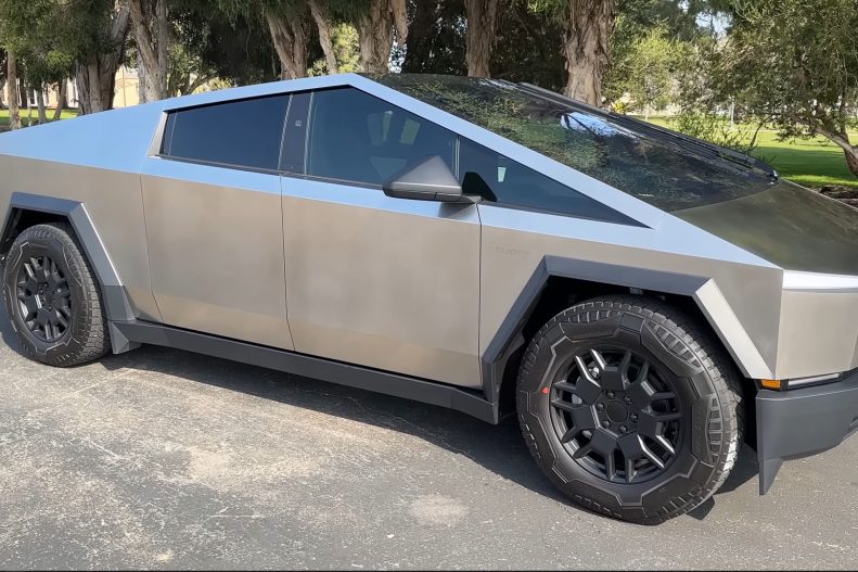
By now we’ve all seen the Tesla Cybertruck somewhere, either on the road, or in video from YouTube influencers, some have already changed the looks of this massive electric vehicle by installing a wrap or even custom wheels, but while this truck sure comes with some serious controversy, you can’t...
Maserati MCXtrema, the Trident’s uncompromising 730-hp ‘beast’ has returned to be unleashed into its natural environment: the track. It will be undergoing a series of tests until late April, aiming at the delivery of the first model, planned for late summer 2024. The MCXtrema is a track-only homologated race car...
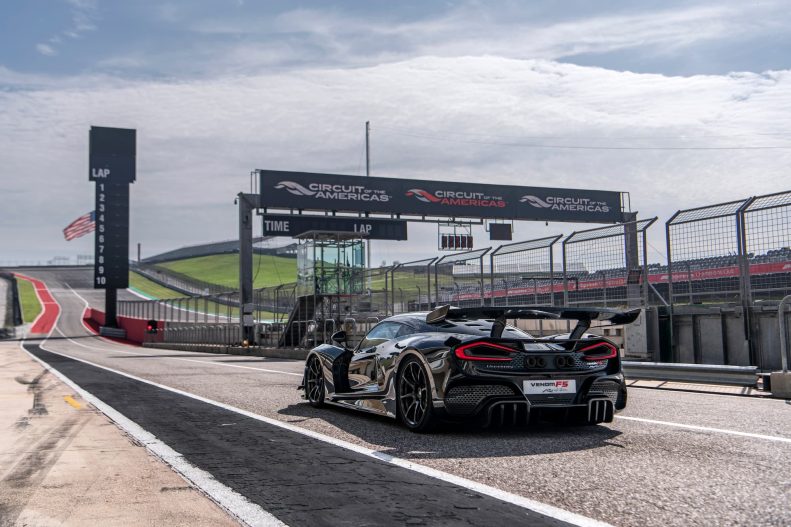
The Hennessey Venom F5 Revolution hypercar has made history by setting a new production road car lap record at the Circuit of The Americas (COTA), clocking in at 2 minutes and 10.90 seconds on the 3.41-mile-long track. Surpassing the McLaren P1 by 7 seconds and the previous record holder, the...
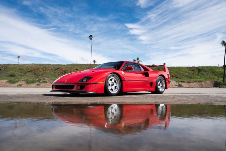
The Ferrari F40, a celebrated icon in automotive history, emerged from Ferrari’s response to the Group B rally competition threat posed by Porsche’s 959. Despite the cancellation of Group B in 1986, Ferrari transformed the 288 GTO Evoluzione prototypes into road-worthy F40s, debuting in 1987. Pininfarina’s design, coupled with Scaglietti’s...
Even More Supercars
Yes, there is more awesome car news and update.
Versace and Lamborghini joined forces in 2007 to craft a limited series of Murciélago LP640 coupes and roadsters. These models retained the mechanical specifications of the standard LP640 but stood out with luxurious interiors. Adorned with Versace’s signature Grecian motif, the cabins boasted full grain Nero and Bianco nappa leather...
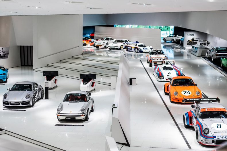
We all know the official Porsche museum located in Stuttgart, Germany, which is open to the public from Tuesday to Sunday, from 9 am to 6 pm, just visiting the museum will set you back €12 for adults, but if you are a Porsche Club member you’ll get into this...
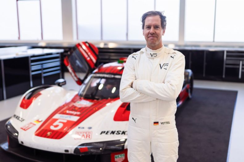
Formula 1 legend, Sebastian Vettel, has linked up with the Porsche Penske Motorsport works team as part of their Porsche 963 program. This marks a special milestone in that it will be the first time that we’ll be seeing the four-time world champion piloting a hypercar prototype. Despite his indisputable...
In the realm of racing greatness, Andy Wallace’s illustrious career stands out as a shining beacon. From being part of a very select group of people to have won the Triple Crown of Le Mans 24 Hours, 24 Hours of Daytona and the 12 Hours of Sebring to his pivotal...

While the EV market seems to have slowed down considerably in the last few months, and several car manufacturers are postponing their plans to cancel all ICE, or internal combustion engines, by several years, I guess that didn’t deter Mercedes from putting a very high-end luxury EV SUV on the...
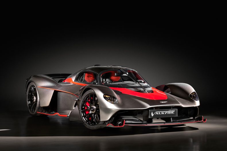
The Aston Martin Valkyrie represents the rare fusion of road-legal status and top-tier motorsport performance. Born from collaboration between Aston Martin and Red Bull Racing, its conception was heavily influenced by Adrian Newey, Red Bull’s technical director and aerodynamics expert. Tasked with creating a hypercar closely mirroring an F1 car’s...
In tribute to Ferrari’s 90th Anniversary, the Ferrari SF90 Stradale stands at the top of the Maranello manufacturer’s series production car lineup. Equipped with a twin-turbocharged 4.0L V-8 engine paired with three electric motors—one powering each front wheel and the third positioned between the engine and Ferrari’s new 8-speed dual-clutch...
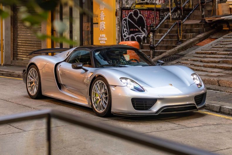
The Porsche 918 Spyder was a mid-engined, plug-in hybrid hypercar that finally proved that gearheads had nothing to worry about when it came to hybrid technology becoming a bigger part of our automobiles. The heart of the Porsche 918 Spyder was a naturally-aspirated 4.6-liter V8 engine that was capable of...
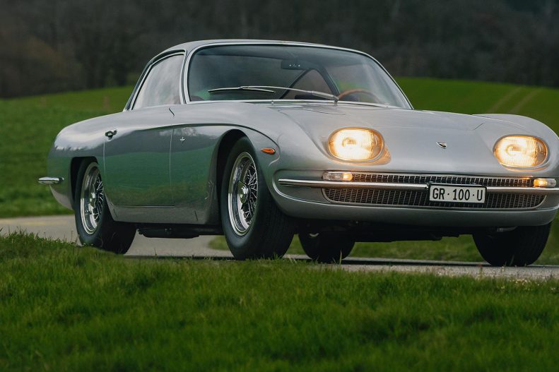
In March 1964, Automobili Lamborghini was still in its infancy. Established just a few months previously, it had presented its first prototype in October 1963, known as the 350 GTV designed by Franco Scaglione and built at Carrozzeria Sargiotto in Turin. The production car, derived from that first prototype (which...
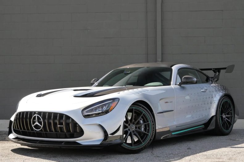
The Mercedes-AMG GT Black Series Project One Edition was created specifically for the 275 customers who had pre-ordered the German manufacturer’s plug-in hybrid hypercar, initially unveiled in ‘concept’ form in 2017. Featuring a hybrid petrol/electric powertrain derived from Formula 1 technology, bringing this innovation to a series production road car...
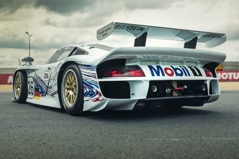
In spite of its 911 moniker, the car actually had very little in common with the 911 of the time, only sharing the front and rear headlamps with the production sports car. Designed and developed to compete in the GT1 class of sportscar racing, which also required a street-legal version...
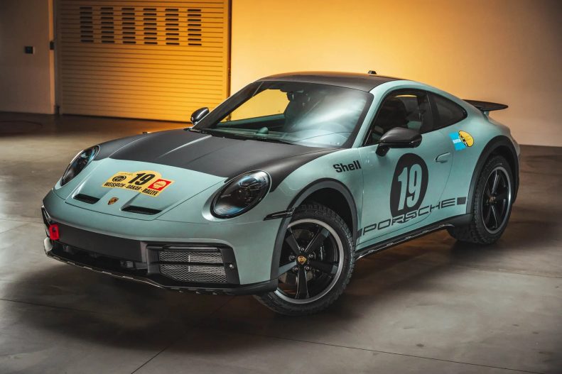
The special edition Porsche 911 Dakar is equally at home on loose surfaces as it does on country roads. The exclusive model limited to 2,500 units globally demonstrates that the concept of the Porsche 911 knows almost no boundaries. It harks back to the first overall Porsche victory at the...
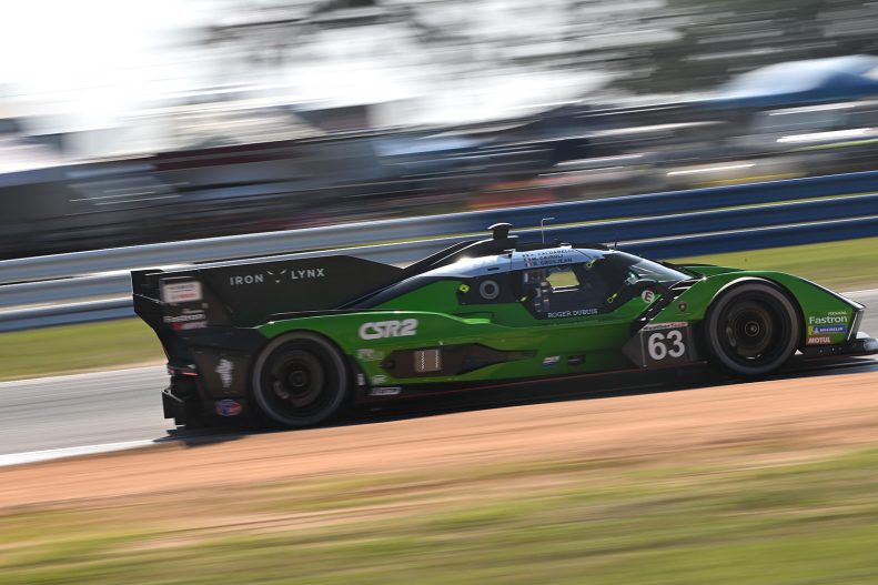
Lamborghini Iron Lynx will take part in the GT Prototype class of the IMSA WeatherTech SportsCar Championship for the first time this weekend as the SC63 LMDh makes its US debut in the 12 Hours of Sebring. Having made its competitive bow in Qatar a fortnight ago, the SC63 will...
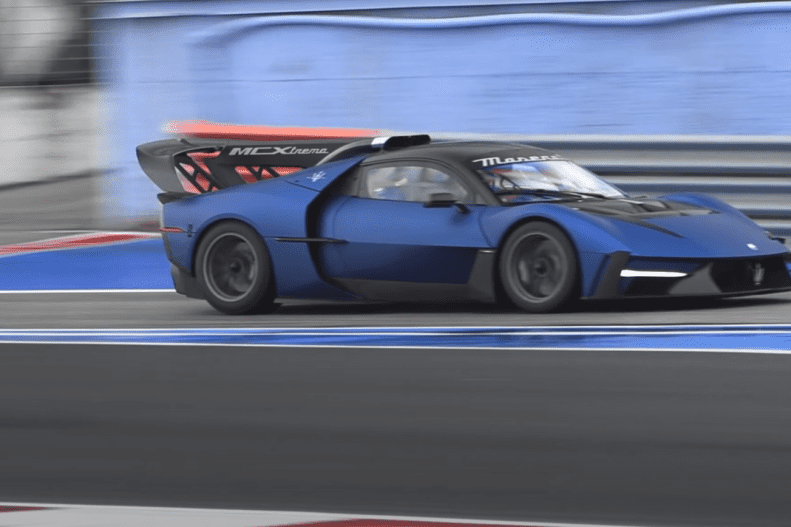
Presented as the Modena-based brand’s most powerful track car, the Maserati MCXtrema is a courageous and exceptional car from all points of view, designed for purist collectors and for the loyal customers of the brand, who wish to add a new “toy” to their garage that can swallow up the...
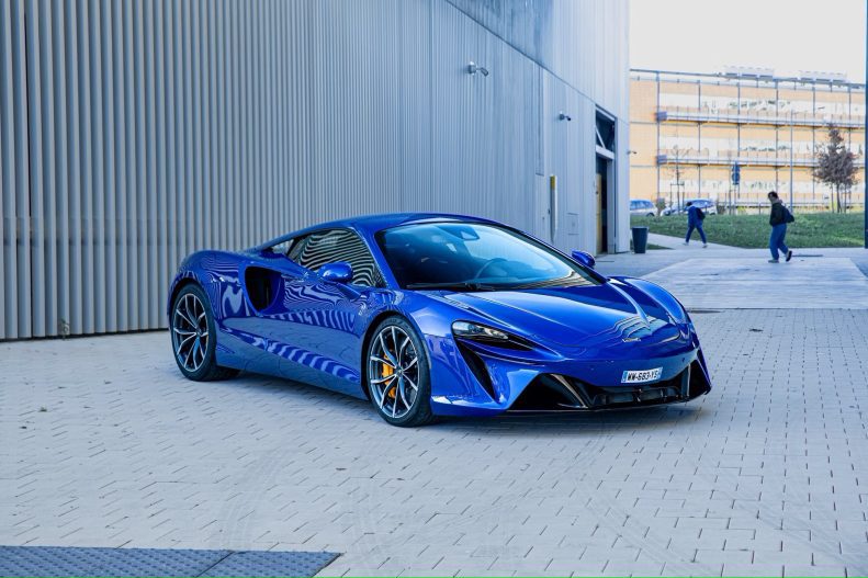
Every drop of McLaren’s technical expertise and experience has been channeled into making the Artura extraordinary to drive and wonderfully enjoyable to own. Ever since the 12C revolutionized the supercar segment a decade ago, McLaren Automotive has continued to push the boundaries of supercar innovation. The McLaren P1 brought McLaren...